


One of the common challenges when designing responsive design for mobile is the navigation menu. If the site has many sections or pages, it gets challenging to squeeze all the items into a small mobile resolution. The navigation most likely ends up running into multiple lines or the buttons stacking on top each other. So I'm going to review some of the design solution and provide a quick tutorial on how to create a mobile navigation with jQuery.
Problem
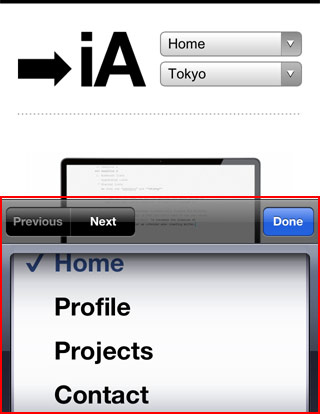
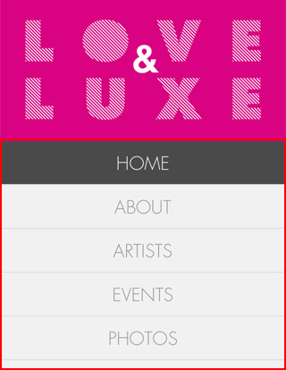
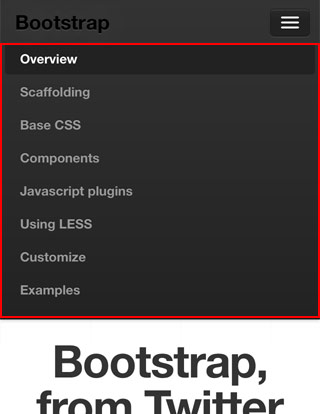
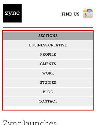
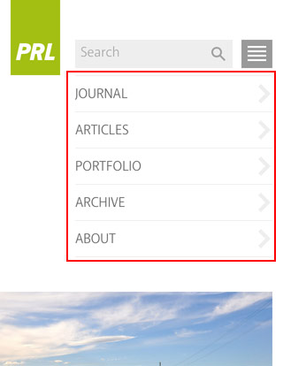
The screenshots below show the navigation layout issues on mobile. If the navigation has 3 or 4 buttons like Web Designer Wall, then the navigation won't wrap into two lines. But if the navigation contains 6 or more buttons, they will stack on top each other.

Solutions
1) Dropdown
One of the commonly used solution is to convert the navigation into a select dropdown. I'm not a big fan of this approach because the <select> element is not stylable with CSS. Javascript plugins like Chosen enables you to modify the dropdown menu, otherwise you end up with the default system dropdown styles. It also causes inconsistent user experience where the desktop version displays link tags and the mobile version displays as a dropdown menu. If you like this solution, here is a tutorial by CSS-Tricks on how to convert a menu to a dropdown.

2) Display as Block
Another quick fix is set each menu item as block elements so they display vertically. But this approach takes a lot of header space. If the navigation has many buttons, this is a bad idea because the readers have to scroll down through the long list of navigation before reaching the content.


3) Menu Icon
The last solution that I'm going to review is to use a menu icon/button to toggle the navigation. I like this method out of the three because it saves space (very important on mobile) and it gives you full control of styling with CSS. The menu icon can be styled to match with the overall design.

Mobile Navigation with jQuery (view demo)
This tutorial shows you how to create a mobile navigation with jQuery as seen on the sites listed above. jQuery will be used to prepend the menu icon and toggle the navigation. This trick doesn't require any extra/un-semantic HTML tags.
HTML
Below is the sample navigation HTML used in this tutorial:
<nav id="nav-wrap">

 <ul id="nav">

">Button</a></li>
  <li><a href="
  <li><a href="
##">Button</a></li>
 </ul>


</nav>
jQuery Code
Include a copy of jQuery and the function below in between the <head> tag. The function will prepend the <div id="menu-icon"> in the <nav id="#nav-wrap"> tag. When the #menu-icon element is clicked, it will slide down the navigation.
<script type="text/javascript" src="http://ajax.googleapis.com/ajax/libs/jquery/1.7/jquery.min.js"></script>

<script type="text/javascript">
jQuery(document).ready(function($){

 /* prepend menu icon */

.on("click", function(){
  $("#nav").slideToggle();
  $(th
 $('#nav-wrap').prepend('<div id="menu-icon">Menu</div>');

 /* toggle nav */
 $("#menu-icon"
)is).toggleClass("active");
 });

});


</script>
It will render the HTML code like this (you need to Inspect Element or view generated source code to see this):
<nav id="nav-wrap">


<div id="menu-icon">Menu</div>


 <ul id="nav">

>Button</a></li>
  <li><a href="#
  <li><a href="#
"">Button</a></li>
 </ul>


</nav>
CSS
I'm not going to explain every detail of the CSS code because it is pretty straight forward. Instead, I will talk about the key parts.
The #menu-icon is set to display:none initially. I used media query to change the #menu-icon to display:block if the viewport width is smaller than 600px.
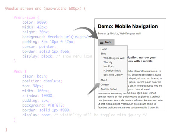
In the media query, I set the navigation to display:none so it is hidden initially on mobile. When the #menu-icon is clicked, it will toggle the navigation as specified in the jQuery function at the above step.
Final Demo
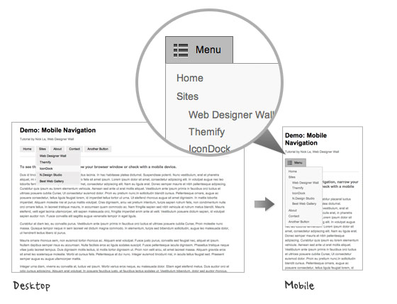
To see the final mobile navigation, view the demo and narrow your browser window or check with your mobile phone.


Thanks for sharing this tutorial!
ReplyDeleteThat was really helpful
Melbourne Web Developer